
Project details
-
Lead designer, responsible for conducting competitive and comparative analysis, wireframing, ux & ui design, animation & illustration, and defining tech constraints and product requirements with product & engineering.
-
Wellframe is a platform for health plans to deliver digital, whole-person health management to their members, meeting those people on their own terms and in a convenient, easy-to-use format.
On the Wellframe mobile app, members connect directly via HIPAA-compliant chat with care management teams, customer service representatives, and other support staff who are integral to their health journeys. The app also serves as a way to deliver condition-specific educational content, reminders for appointments and medications, and more.
On the Wellframe web dashboard, health plan staff — primarily care managers, who support members who struggle with their chronic diseases or complex conditions — manage and prioritize their caseload, message and engage with their members, and customize their members’ experience with content appropriate to where their members are at.
-
The Wellframe mobile app faced many issues that were decreasing potential signups for the program:
30% of successful signups required help from the Wellframe Support team to complete the flow;
50% of the Support team's time in 1H 2019 was spent resolving issues related to sign up;
Client Services & Operations maintained 15-step job aids for clients to assist their patients in sign (and usually they still had to come to our internal Support team to finish the task)
Engineering had a backlog of 175+ WCAG/accessibility violations to fix, while Data Science couldn't pull reliable data for analysis on detailed conversion rates throughout the flow.
The objectives of this project were to utilize visual and content design to bring a friendlier, more welcoming tone to the experience, clarify confusing required steps in the flow, and reduce the cognitive load on each screen — without changing the basic technical underpinnings of its APIs.
-
I departed before this new experience launched, but our success metrics were:
Reduce % of active users who need Support team assistance to sign up from 30% (1H 2019 benchmark) to 15% — a 50% reduction
Reduce % of tickets Support queue related to sign-up from ~50% (1H 2019 benchmark) to 15% — a 70% reduction
Reduce # WCAG & accessibility bugs in backlog (175 in 1H 2019) by 95% — ✨ This was successfully achieved!

Discovery
Comparative analysis
I looked at apps with similarly complex signup flows that require lots of highly specific information for identity verifaction.

The Robinhood investing app, one of the north stars I examined at length. I liked their focus on low cognitive load, by only having the user fill out one field at a time.

Wealthsimple, another financial app that I looked at for inspiration. I liked the progress bar and the “Let’s get you set up” screen (bottom left) to give context for all the information that they would be asking for next.
Technical discovery

User flow diagram of the all the possible sign-up variations

Whiteboarding the sign-up flow and where it hits the API endpoints
Wireframing & early prototyping

Early-stage sketches

First-pass wireframes
Design + engineering workshop
There was a disconnect between what I had learned in my discovery and what the mobile development team knew about the code for the signup flows: how it worked currently and what I proposed changing. To get the entire team on the same page (including our newly hired PM), I facilitated creating an artifact to share my knowledge, in a collaborative way: I led a series of design workshops to construct a “blueprint” of the onboarding paths. Our first session was very simple—we merely plotted out the screens from my prototype and indicated where each API call was made. Over time as we considered each idea and made decisions about what to change, we added those details to our blueprint.

Our entire blueprint for the sign-up experience, including flags for screen taxonomy, event logging naming conventions, API calls, components, expected behaviors, error states, field validation, image assets, navigational model notes, and more.

Color-coordinated post-it notes overlay several types of information—everything from the form fields on each screen (including what entries should trigger errors, and what validation each should have), to naming conventions for the screens to be used in tagging for event-logging data.
Visual design

Illustration mood board and the resultant illustration components


Top: Defining animations for screen transitions;
Bottom: defining micro-interactions for text fields

New visual design language and component based design framework that resulted from the flow redesign

Selection of screens in final design style
Content design

Defining content strategy throughout one variation of the user experience

Writing error states and dialogs

Documenting content for development, so we could more easily update rather than relying on mockups to have the exact final copy
Solution
The final solution for this project is a bold statement about the direction that Wellframe’s mobile app design is moving. With a new, crisp visual design language, a refined content strategy and tone of voice, and lower cognitive load per screen in this complicated flow, Wellframe is poised to make a great first impression on new users. The new sign-up flow provides a smooth user experience that introduces Wellframe’s brand and conveys their value prop in a simple, accessible, and friendly format.
Recording of live product

Start screen
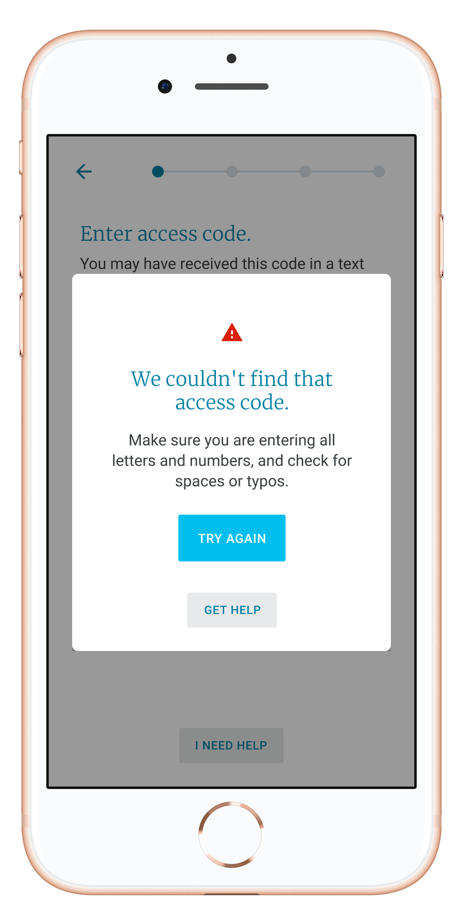
Error message

Access code screen

Inline error

Loading/checking screen

Step completion confirmation